Introducing EP Rinkside On-Ice, Microdata for NHL Entry Draft and Drafted Prospects

At EP Rinkside we strive to offer the most detailed level of prospect and NHL Entry Draft analysis to our readers.
In that never-ending drive to reach the most sound conclusions and tell the most compelling stories, we’ve had to push ourselves to do countless hours of work behind the scenes, not all of which has an immediate payoff. One such example is the tireless data tracking that EP Rinkside’s Editor-in-Chief, J.D. Burke, and EP Rinkside contributor Mitch Brown undertook this season.
In the end, the two combined to track over a thousand hockey games (Brown alone probably accounts for about 600 games himself) worth of data at lower levels of hockey, in which either drafted prospects or prospects on the way to the draft are likely to play.
Here is a little bit of information on each of their databases, what drove the two to carry out this project, and even links to access the Tableau pages where this information is available for public consumption.
Mitch Brown
For years I’ve longed for better data at the CHL level. When the OHL finally started recording shots and faceoffs three seasons ago, I remember being elated. Seriously.
In the past decade analytics pioneers, like Eric Tulsky, Corey Snzajder, and Ryan Stimson, shaped discourse with the manually tracked NHL data. Now, machine learning and artificial intelligence have allowed companies such as SPORTLOGiQ to bring tracking data to the highest levels of hockey.
However, even with the advancements made by the CHL in recent years, the publicly available data pales in comparison to the equivalent in the NHL.
That’s why I started recording basic tracking data two seasons ago, beginning with zone entries, exits, and shots. Eventually, it morphed into a 250-game, 1000-plus hour project that I released for free.
This year, I decided to dedicate my free time to tracking as many CHL games possible. Now, thanks to hard work and a shockingly large Patreon base, I’m able to release part of the data publicly.
Hello everyone, I've launched a Patreon. Support will help keep my CHL tracking data in the public sphere. If you'd like to support me and/or get early access to this year's project, check out my page: https://t.co/jYOMn1olE9
— Mitch Brown (@MitchLBrown) November 16, 2018
In total, this data set features 450 (and growing) of the 520-plus games I’ve tracked this season. It features over 750 players with at least six games tracked, and 500 with at least nine. Highlights include:
- 41 CHL teams, 4 USHL teams (NTDP, Cedar Rapids, Dubuque, Sioux Falls).
- Every notable 2019 NHL Draft eligible, and plenty of sleeper prospects.
- 135 NHL Draft picks from all 31 teams.
And all this data is viewable in an easy-to-interpret, interactive Tableau visualization. But before providing the link, I’d like to take the time to explain what this data is and why or if it matters.
New in This Year’s Tracking Data
There are several distinct features in my visualization. First, the zone exit data only includes exits with forechecking pressure. The average player sees their Controlled Exit Percentage drop by 20-plus percent when faced with pressure (as in, they dump the puck out more often). To control for the exits without pressure, I simply excluded them.
Second, the Controlled Exit and Entry Percentage, and Zone Entry Defence, statistics are relative to the team average. I chose this because a team’s structure appears to determine the choices a player makes in transition. For example, Lassi Thomson’s 55.6 Controlled Exit Percentage (with pressure) would place him right around the 50th percentile. However, Kelowna as a team prefers to dump the puck out while under pressure. Once converting the statistic to relative measures, Thomson’s 26 percent relative to team average lands him in the 98th percentile. Therefore, I believe using relative statistics better describes what occurred in transition in the sample.
Third, I’ve introduced Expected Goals and Expected Primary Assists. Expected Goals is merely a weighted average of the shots a player takes, accounting for location, type, and passes preceding the shot. Expected Primary Assists gives the passer credit. I introduce these statistics with caution, however, as their subject to change. The statistics are based on historical averages, which I gathered through 34,000 shots (which isn’t that much). However, I believe they, once again, better describe the data than raw scoring chances. For example, a point-blank shot from the hashmarks goes in roughly 20 percent of the time. Make that shot a one-timer? 26 percent. Add a cross-slot pass into the mix? 46 percent.
Does it matter?
The above is the most important question relating to the data. I don’t have a complete answer other than “kinnnnda.” The truth is, this my second year into an ultra-time consuming (literally over a thousand hours) first-of-its-kind project. I’m still adjusting what I track and how I track it.
While 450 games might seem like a lot, nine tracked games for top-prospect Joe Smith constitutes only 13 percent of every game he played this season. That’s not much. In addition, I haven’t gathered enough data to conduct any statistical tests. So, in this current state, I do not know if the data is repeatable (within a season or between seasons) or predictive of NHL success.
Of course, tracking data isn’t meant to replace or even compare to watching the games because what a prospect is today isn’t necessarily the point of scouting — the point is projecting what the prospect will become. Merely, it’s meant to complement it.
Therefore, the data isn’t meant to be accepted or rejected; it’s meant to engage the interpreter. Use the data to challenge what your eyes are telling you. There’s no perfect way to weigh tracking data versus production versus watching the games. That’s the analyst’s prerogative.
The data is descriptive, not predictive. It, in my opinion, does a solid job of describing what occurred within the sample. An example of a conclusion I feel comfortable drawing while using the data is: Scoring in the 90th percentile in Expected Primary Assists per 60 suggests that Henrik Rybinski was a standout playmaker in a ten-game sample.
How do I read the charts?
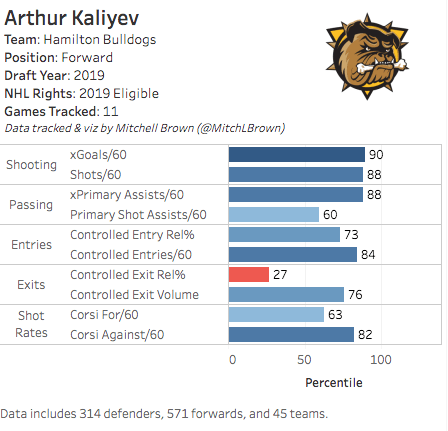
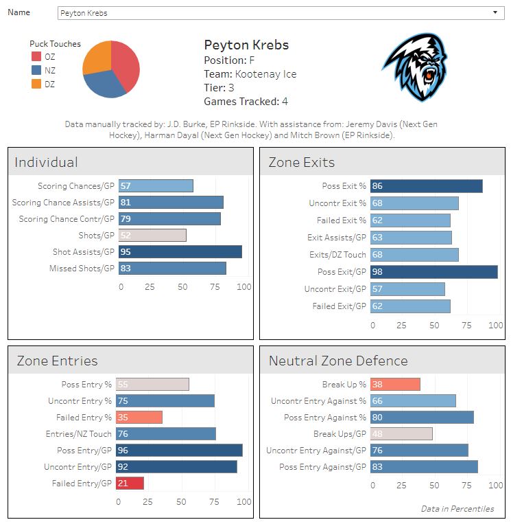
For both my own data and J.D. Burke’s, the visualizations use percentiles. Percentiles show where a player’s value in a statistic falls within the group. In other words, if a player falls in the 90th percentile in a statistic, that means their value is better than or equivalent to 90 percent of the player’s in the data set.
Percentiles are easy to interpret, but also come with a trade-off in a loss of nuance. For example, Jack Hughes’ Expected Goals per 60 (xG/60) in a 13-game sample is 2.65, landing in the 100th percentile. Jason Robertson’s xG/60 is 2.10 in a 10-game sample, landing in the 99th percentile. There’s one percentile different; however, the difference in the raw value is 0.45. Values closer to average are more prone to significant shifts in percentiles. That same 0.45 xG/60 difference that separates the 100th and 99th percentiles separates the 40th and 60th percentile.
This leads us nicely into the next note: data in the middle percentiles is prone to significant change within a small increase in the sample. While Hughes’ 100th percentile xG/60 isn’t going anywhere until many more games are added, a single game can shift the 60th percentile player in xG to the 40th. Therefore, look for extremes.
As discussed earlier, the data is descriptive. I think it best describes the style (i.e., passer versus shooter) of the player, rather than how good they are at it, unless in the extremes. The data describes the output within the sample, not the input.
To take a look at the data for yourself and find out where your favourite team’s prospects stand, follow this link!
J.D. Burke
Well, that covers most of what I was going to say. Way to steal my thunder, Mitch. Not a lot of meat left on the bones here.
I’ll keep it short and simple, then, and try to build on some of the points that Brown made about his data set and the resulting Tableau profile, and how they relate to my own little project.
My motivation
As a long-time contributor and managing editor of CanucksArmy, analytics had always been a big part of how I performed my analysis of the NHL game. That was the site’s reputation, and I was all too eager to dive in.
I didn’t have a background in math or data science; I graduated with Essentials of Math 11 and had no post-secondary education to my credit. Ultimately, I just loved the game of hockey and wanted to learn as much about it as possible. After a couple of months researching these new terms and numbers, it was clear to me that a lot of this stuff was easy to interpret on the user end.
Then I started to cover the NHL Entry Draft. I couldn’t believe how little data was available to me. The WHL didn’t even track shots when I started doing this, which says nothing of the other major junior leagues and all their own unique quirks.
Luckily, I had access to some pretty interesting stuff during my time at CanucksArmy. Cam Lawrence, Josh Weissbock, and Rhys Jessop were breaking ground on all sorts of new metrics, and ultimately, they were valuable enough to land each a gig with the Florida Panthers. Jeremy Davis, the co-founder of Next Gen Hockey, stepped in and did some truly fascinating work following in their footsteps, too.
That data was highly predictive and often did a great job of laying out what type of future one could expect from any given prospect. None of it really addressed the gap in coverage that one experiences going from the NHL to junior leagues though.
So, I figured I would cover that base myself. This season. And as soon as I started to carve out a role for myself with EP Rinkside, I went to work, tracking hundreds of games to build this database.
The data and its limitations
As a part of this project, I decided to track: on-ice shot attempts, on-ice scoring chances, individual scoring chances, individual shots, individual missed shots, puck touches (and the zone they occurred in), zone entries, zone exits, controlled entries against, uncontrolled entries against, failed entries against. Pretty standard stuff — for the most part — at the NHL level, but nowhere to be found anywhere else.
Unlike Brown, I tried to capture many of the top European prospects in this year’s draft in this project along with those on this side of the pond. Of course, the problem with that is that so many of those players have limited sample sizes as a result, even relative to the group as a whole — we’re talking one or two games in some cases.
The player I’ve tracked most in this class is Kaapo Kakko. In most cases, on-ice data starts to normalize after about the 30-game mark and microdata around the 20-game mark. I only have 12 Kakko games on file. So even the largest samples in my data set only offer descriptive value. As Brown so eloquently put it, it’s not about whether it’s right or wrong; it’s interesting information to throw into the overall evaluation.
To see that data, follow this link
A special shout out to Mitch Brown, Next Gen Hockey co-founder Jeremy Davis, the indispensable Prospect-Shifts and Next Gen Hockey contributor Harman Dayal for their help in putting this together.